
President’s Club Logo Refresh
Client: Sager Electronics
Year: 2025
Overview
Sager Electronics partnered with Sullivan Design to refresh the visual identity for their prestigious President’s Club program. The goal was to honor the legacy of the original logo while creating a modern, scalable system suitable for today’s diverse branding needs.
Objectives
Preserve recognition and historical value of the original mark
Improve versatility for digital, print, and event-based applications
Enhance visual clarity and prestige through refined typography and layout

Design Approach
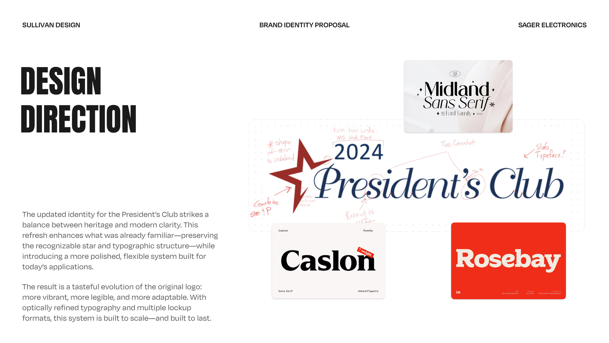
The refreshed logo maintains the core symbolic elements—particularly the iconic red star and typographic structure—but elevates the system through optical refinements and thoughtful customization. A classic serif typeface was modified with softened edges, balanced curves, and improved spacing to deliver a more legible and timeless logotype.
Multiple lockups were developed—including primary, secondary, and monogram variants—ensuring flexibility across touchpoints. A vibrant, modernized color palette brings new energy while staying true to the brand’s heritage.


Outcome
The final identity is bold, elegant, and built to last. It strikes a confident balance between heritage and innovation, and now serves as a recognizable mark of excellence across all President’s Club communications.


Services
Logo Design
Custom Typography
Visual Identity System
Color Palette Refinement
Presentation Design